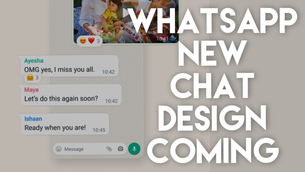
Whatsapp has undergone a lot of changes with the new update and it is testing a bottom navigation bar and also a new message menu is being developed. According to a report from WABetaInfo, WhatsApp, which is owned by Meta, is planning to implement a new revamped Context Menu specifically for Android users. This significant update is included in the latest beta version 2.23.11.4 of WhatsApp for Android. If you have signed up for the beta testing program you can receive the update once you have updated Whatsapp.

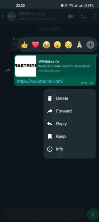
Based on the provided screenshot, it is evident that the redesigned Context Menu in WhatsApp for Android includes some notable changes in there. When a user taps and holds a message, the emoji bar now appears at the top, while the context menu is presented as a drop-down floating menu at the bottom which is new. This updated menu retains all the existing options such as Delete, Forward, Reply, Keep, and Info, which were previously located at the top. So basically this is a design revamp in the Whatsapp.
Also, with this change, the Android interface of WhatsApp is becoming more similar to the context menu which is found in iOS. All these options in one place enhance the app accessibility and create a consistent experience across both the iOS and Android versions of WhatsApp.
Also with this change, Whatsapp is also testing the capability to edit and save contacts directly within the app, eliminating the need for users to be redirected to the Phone app. This change aims to streamline the process and make it more convenient for users at the same time.
